
CSS Login Page
A CSS Login Page is one of the most common projects every beginner builds. It combines layout, forms, buttons, and responsive design. In this chapter you'll learn how to design a clean, modern, fully responsive login page using only HTML and CSS.
Key Login Page Components
Login Card
Centered container holding the form.
Form Inputs
Email/username and password fields.
Submit Button
Primary call-to-action button.
Forgot Link
Helper link for password recovery.
Background
Gradient or image for visual appeal.
Responsiveness
Adapts to phones and tablets.
Login Page Syntax
.login-card {
    width: 360px;
    padding: 40px;
    background: white;
    border-radius: 12px;
    box-shadow: 0 10px 30px rgba(0,0,0,.15);
}
input {
    width: 100%;
    padding: 12px 14px;
    margin: 10px 0;
    border: 1px solid #ddd;
    border-radius: 8px;
}
button {
    width: 100%;
    padding: 12px;
    background: #1a73e8;
    color: white;
    border: none;
    border-radius: 8px;
    cursor: pointer;
}
Login Page
A CSS login page provides a secure and user-friendly interface for user authentication. CSS styling improves layout, spacing, colors, buttons, and responsiveness to create a professional login experience.
Example 1 : Simple Login Page
This example creates a centered login form with username and password fields.
<!DOCTYPE html>

<html lang="en">

<head>

<meta charset="UTF-8">

<meta name="viewport"
content="width=device-width,
initial-scale=1.0">

<title>
Login Page
</title>

<style>

body{

    font-family:Arial,sans-serif;

    background-color:#C0DBF0;

    display:flex;

    justify-content:center;

    align-items:center;

    height:100vh;

    margin:0;

}

.login-container{

    background-color:white;

    padding:20px;

    border-radius:8px;

    box-shadow:
    0 0 10px
    rgba(0,0,0,0.1);

    width:300px;

}

.login-form{

    display:flex;

    flex-direction:column;

}

.login-form h2{

    text-align:center;

    margin-bottom:20px;

}

.form-group{

    margin-bottom:15px;

}

.form-group label{

    font-weight:bold;

}

.form-group input{

    padding:8px;

    width:100%;

    box-sizing:border-box;

    border:1px solid #ccc;

    border-radius:4px;

}

button{

    padding:10px;

    background-color:#4CAF50;

    color:white;

    border:none;

    cursor:pointer;

    border-radius:4px;

}

button:hover{

    background-color:#45a049;

}

.register-link{

    text-align:center;

    margin-top:10px;

}

.register-link a{

    color:#007bff;

    text-decoration:none;

}

.register-link a:hover{

    text-decoration:underline;

}

</style>

</head>

<body>

<div class="login-container">

<form action="#"
method="POST"
class="login-form">

<h2>
Login
</h2>

<div class="form-group">

<label for="username">
Username
</label>

<input type="text"
id="username"
name="username"
required>

</div>

<div class="form-group">

<label for="password">
Password
</label>

<input type="password"
id="password"
name="password"
required>

</div>

<button type="submit">
Login
</button>

<p class="register-link">

Don't have an account?

<a href="#">
Register here
</a>

</p>

</form>

</div>

</body>

</html>
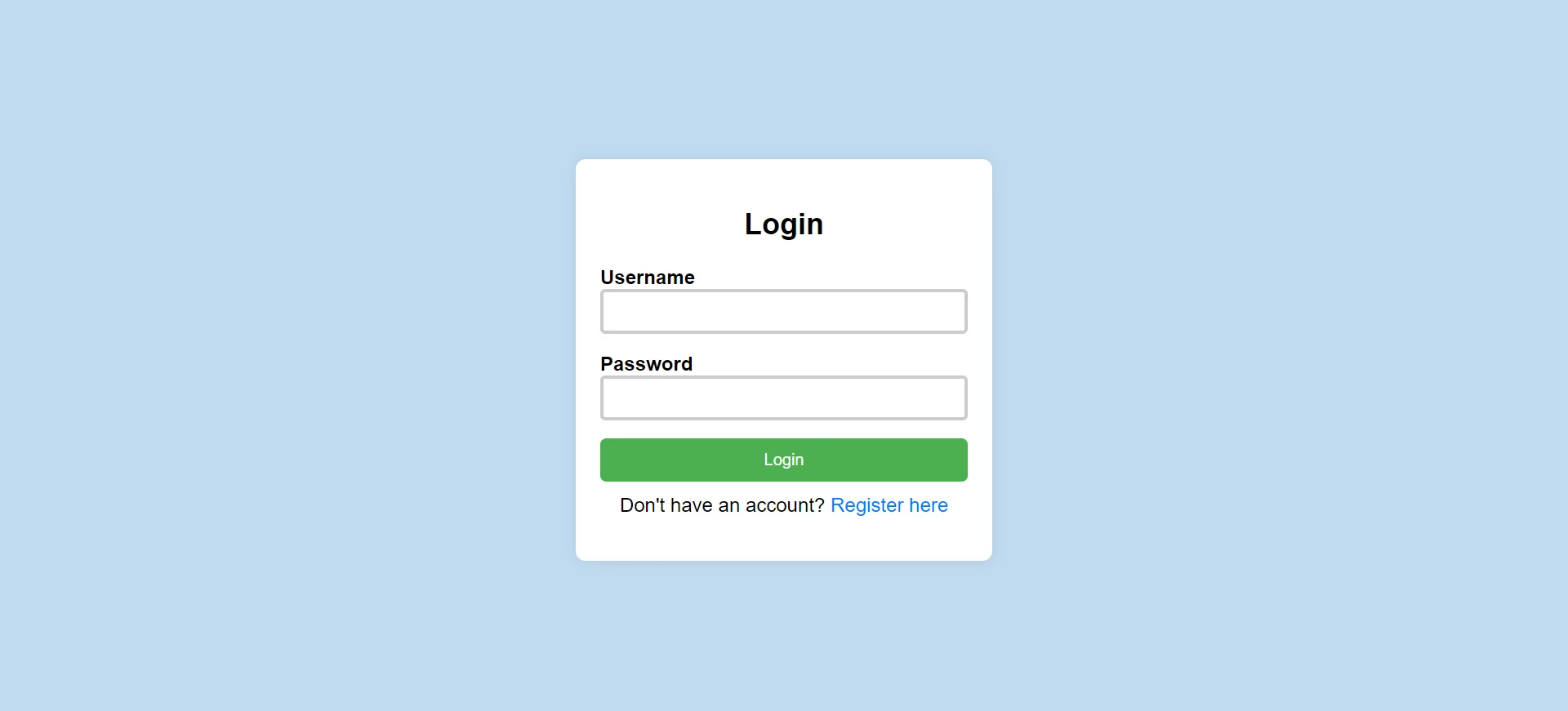
- display:flex: Centers the login box.
- border-radius: Creates rounded corners.
- box-shadow: Adds depth effect to the form.
Example 2 : Background Image Login Page
This example creates a login page with a background image and styled form.
<!DOCTYPE html>

<html lang="en">

<head>

<meta charset="UTF-8">

<meta name="viewport"
content="width=device-width,
initial-scale=1.0">

<title>
Login Page
</title>

<style>

body{

    font-family:Arial,sans-serif;

    background-image:
    url(backimage.webp);

    display:flex;

    justify-content:center;

    align-items:center;

    height:100vh;

    margin:0;

}

.login-container{

    background-color:white;

    padding:20px;

    border-radius:8px;

    box-shadow:
    0 0 10px
    rgba(0,0,0,0.1);

    width:300px;

}

.login-form{

    display:flex;

    flex-direction:column;

}

.login-form h2{

    text-align:center;

    margin-bottom:20px;

}

.form-group{

    margin-bottom:15px;

}

.form-group label{

    font-weight:bold;

}

.form-group input{

    padding:8px;

    width:100%;

    box-sizing:border-box;

    border:3px solid #ccc;

    border-radius:4px;

}

button{

    padding:10px;

    background-color:#182733;

    color:white;

    border:none;

    cursor:pointer;

    border-radius:5px;

}

button:hover{

    background-color:tomato;

}

.register-link{

    text-align:center;

    margin-top:10px;

}

.register-link a{

    color:#007bff;

    text-decoration:none;

}

.register-link a:hover{

    text-decoration:underline;

}

</style>

</head>

<body>

<div class="login-container">

<form action="#"
method="POST"
class="login-form">

<h2>
Login
</h2>

<div class="form-group">

<label for="username">
Username
</label>

<input type="text"
id="username"
name="username"
required>

</div>

<div class="form-group">

<label for="password">
Password
</label>

<input type="password"
id="password"
name="password"
required>

</div>

<button type="submit">
Login
</button>

<p class="register-link">

Don't have an account?

<a href="#">
Register here
</a>

</p>

</form>

</div>

</body>

</html>
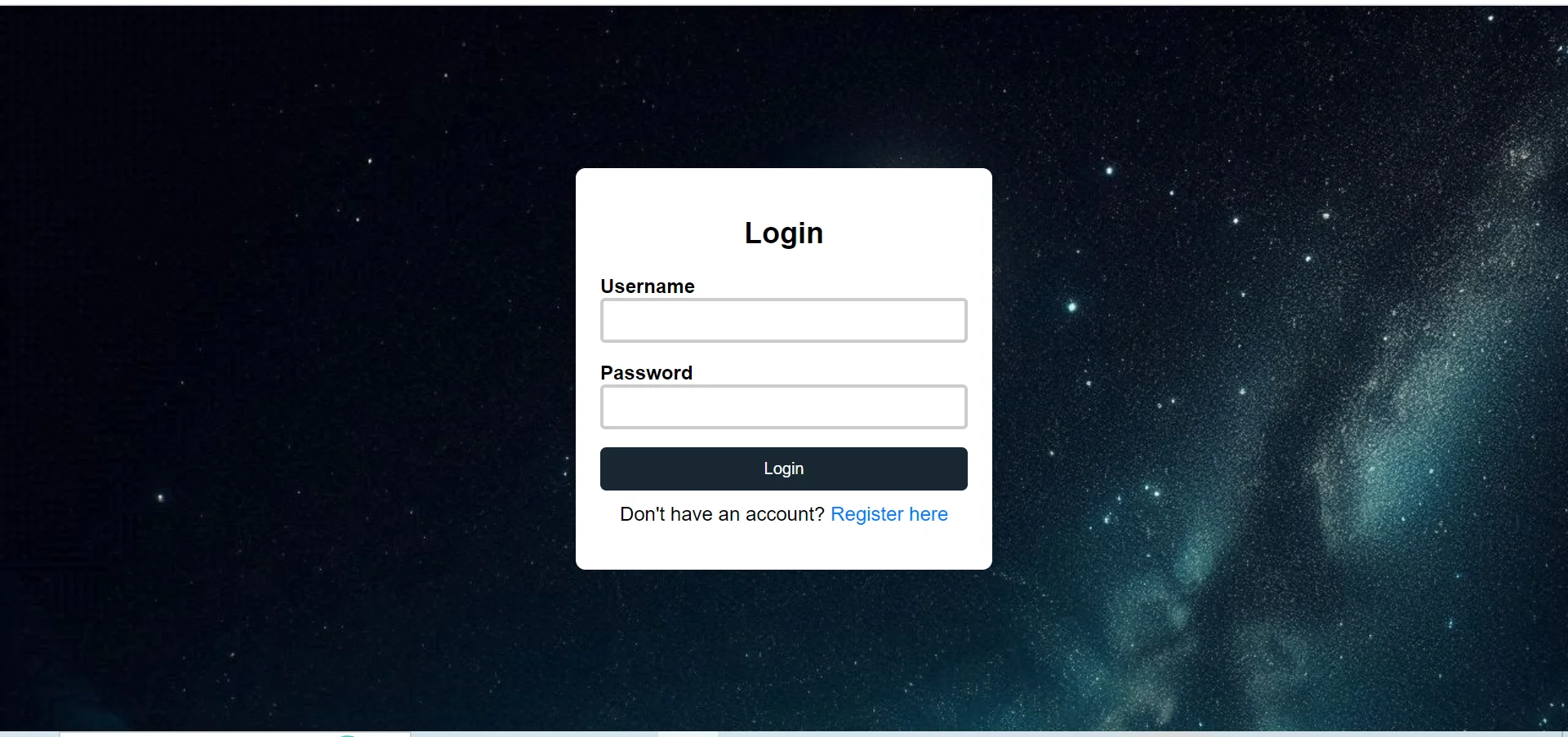
- background-image: Adds image background.
- hover effect: Changes button color on hover.
- border styling: Creates attractive input fields.
Conclusion
CSS login pages improve website usability by providing a clean, attractive, and responsive authentication interface. Proper styling enhances user interaction and creates a professional appearance.
Full Login Page Example
<!DOCTYPE html>
<html>
<head>
    <title>CSS Login Page</title>
    <style>
        * { margin: 0; padding: 0; box-sizing: border-box; }
        body {
            font-family: Arial;
            min-height: 100vh;
            display: flex;
            justify-content: center;
            align-items: center;
            background: linear-gradient(135deg, #1a73e8, #00bcd4);
        }
        .login-card {
            width: 360px;
            padding: 40px;
            background: white;
            border-radius: 14px;
            box-shadow: 0 14px 40px rgba(0,0,0,.2);
        }
        h2 {
            text-align: center;
            margin-bottom: 24px;
            color: #1a73e8;
        }
        input {
            width: 100%;
            padding: 12px 14px;
            margin: 8px 0;
            border: 1px solid #ddd;
            border-radius: 8px;
            outline: none;
            transition: border .3s ease;
        }
        input:focus { border-color: #1a73e8; }
        button {
            width: 100%;
            margin-top: 14px;
            padding: 12px;
            background: #1a73e8;
            color: white;
            border: none;
            border-radius: 8px;
            cursor: pointer;
            font-size: 16px;
            transition: background .3s ease;
        }
        button:hover { background: #0d47a1; }
        .forgot {
            display: block;
            text-align: center;
            margin-top: 12px;
            font-size: 14px;
            color: #1a73e8;
            text-decoration: none;
        }
    </style>
</head>
<body>
    <form class="login-card">
        <h2>PBA Login</h2>
        <input type="email" placeholder="Email">
        <input type="password" placeholder="Password">
        <button type="submit">Login</button>
        <a href="#" class="forgot">Forgot Password?</a>
    </form>
</body>
</html>
Code Explanation
display: flex; align-items: center; justify-content: center: Centers the card both vertically and horizontally.linear-gradient: Creates a vibrant background.box-shadow: Lifts the card off the page.input:focus: Highlights inputs when focused.transition: Smooth color changes for buttons and inputs.
Login Page Sections
| Section | CSS Used | Purpose |
|---|---|---|
| Background | linear-gradient |
Visual style |
| Card | flexbox, box-shadow |
Centered container |
| Inputs | border, border-radius |
Email/password fields |
| Button | background, cursor, transition |
Submit action |
| Forgot Link | text-align, color |
Helper navigation |
Login Page Patterns
Card Layout
Centered card with shadow.
Mobile Responsive
Full-width inputs adapt to small screens.
Modern UX
Smooth transitions and clear focus states.
Common Properties
Important Notes
- Accessibility: Always use labels and proper input types.
- Validate inputs: HTML5
requiredandtype="email"help. - Use HTTPS: Never collect passwords on http pages.
- Keep it minimal: A login page should not distract — keep design clean.
Real-World Use Cases
E-commerce
Account login for shopping.
Learning Platforms
Student/teacher logins.
Admin Panels
Secured admin authentication.
Practice Questions
- Build a centered login card using flexbox.
- Add a gradient background to the login page.
- Style inputs with focus state border-color change.
- Make the login form responsive on mobile screens.
- Add a hover effect to the submit button.
Frequently Asked Questions
- How to center a login card: Use
display: flex; align-items: center; justify-content: center;on the body. - How to add shadow to a card: Use
box-shadow: 0 10px 30px rgba(0,0,0,.15);. - How to highlight input on focus: Use
input:focus { border-color: blue; }. - How to make a login page responsive: Use flexible widths (100%), media queries, and percentage-based sizes.
Conclusion
A well-designed login page balances simplicity, accessibility, and visual appeal. By combining flexbox centering, soft shadows, gradient backgrounds, and smooth transitions, you can create a login experience users trust.
CSS All Topics
Continue Learning
Previous
Go to Layout Chapter