CSS Layout
CSS Layout defines how elements are arranged on a web page. Modern CSS provides powerful layout systems — Flexbox, Grid, Float, Positioning, and Display — that help you build responsive, professional layouts.
Main CSS Layout Systems
Display
Controls how an element renders — block, inline, flex, grid, none.
Flexbox
One-dimensional layout for rows or columns — perfect for navbars, cards.
Grid
Two-dimensional layout system — rows and columns with precise control.
Float
Older layout technique — wraps text around images.
Position
static, relative, absolute, fixed, sticky.
Media Queries
Adapt layouts to different screen sizes.
Flexbox Syntax
.container {
    display: flex;
    justify-content: space-between;
    align-items: center;
    gap: 20px;
}
.item {
    flex: 1;
    padding: 20px;
    background: #1a73e8;
    color: white;
}
Grid Syntax
.grid {
    display: grid;
    grid-template-columns: repeat(3, 1fr);
    gap: 20px;
}
.grid-item {
    padding: 20px;
    background: #00bcd4;
    color: white;
}
CSS Layout
CSS layout controls how elements are arranged on a webpage. It helps organize headers, navigation bars, content sections, and footers using layout techniques like flexbox, grid, positioning, and spacing.
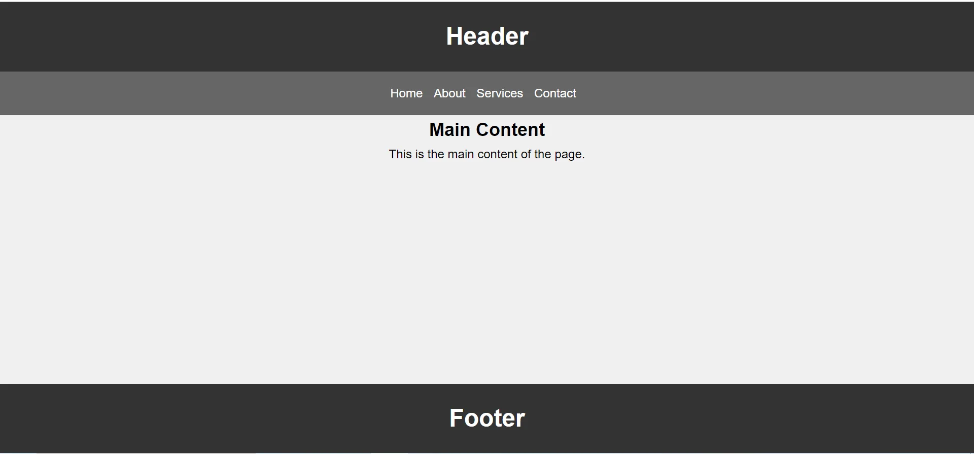
Example 1 : Basic Page Layout
This example creates a simple webpage layout with header, navbar, main content, and footer.
<!DOCTYPE html>
<html lang="en">

<head>
    <title>CSS Layout</title>

    <style>
        *{
            margin:0;
            padding:0;
            box-sizing:border-box;
        }

        body{
            font-family:Arial, sans-serif;
            line-height:1.6;
            background-color:#f0f0f0;
            display:flex;
            flex-direction:column;
            min-height:100vh;
        }

        header{
            background-color:#333;
            color:#fff;
            text-align:center;
            padding:20px;
        }

        nav{
            background-color:#666;
            color:#fff;
            text-align:center;
            padding:16px;
        }

        nav ul{
            list-style-type:none;
        }

        nav ul li{
            display:inline;
            margin-right:10px;
        }

        nav ul li a{
            color:#fff;
            text-decoration:none;
        }

        main{
            flex:1;
        }

        footer{
            background-color:#333;
            color:#fff;
            text-align:center;
            padding:20px;
            margin-top:auto;
        }
    </style>
</head>

<body>

    <header>
        <h1>Header</h1>
    </header>

    <nav>
        <ul>
            <li><a href="#">Home</a></li>
            <li><a href="#">About</a></li>
            <li><a href="#">Services</a></li>
            <li><a href="#">Contact</a></li>
        </ul>
    </nav>

    <main>
        <section>
            <h2 align="center">Main Content</h2>
            <p align="center">This is the main content of the page.</p>
        </section>
    </main>

    <footer>
        <h1>Footer</h1>
    </footer>

</body>
</html>
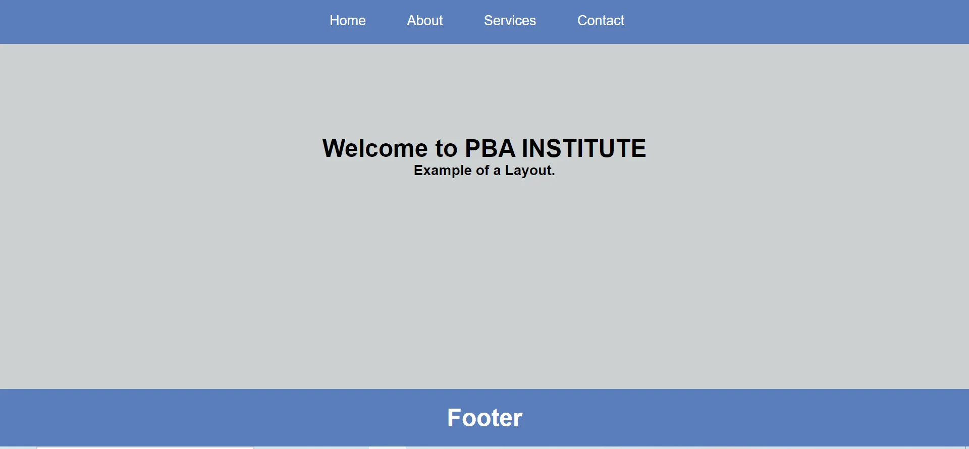
Example 2 : Navbar With Fixed Footer
This example creates a webpage with a navigation bar, center content, and a fixed footer at the bottom.
<!DOCTYPE html>
<html lang="en">

<head>
    <meta charset="UTF-8">
    <meta name="viewport" content="width=device-width, initial-scale=1.0">

    <title>Two Column Layout</title>

    <style>
        *{
            margin:0;
            padding:0;
            box-sizing:border-box;
        }

        body{
            font-family:Arial, sans-serif;
            background-color:#CCD1D1;
        }

        nav{
            background-color:#597EBA;
            text-align:center;
            padding:20px 0;
        }

        nav ul{
            list-style-type:none;
        }

        nav ul li{
            display:inline;
            margin-right:20px;
        }

        nav ul li a{
            text-decoration:none;
            color:#fff;
            font-size:18px;
            padding:20px 15px;
        }

        nav ul li a:hover{
            background-color:tomato;
        }

        footer{
            background-color:#597EBA;
            color:#fff;
            text-align:center;
            padding:20px;
            width:100%;
            position:fixed;
            bottom:0;
        }
    </style>
</head>

<body>

    <nav>
        <ul>
            <li><a href="#">Home</a></li>
            <li><a href="#">About</a></li>
            <li><a href="#">Services</a></li>
            <li><a href="#">Contact</a></li>
        </ul>
    </nav>

    <div style="padding:120px;">
        <h1 align="center">Welcome to PBA INSTITUTE</h1>
        <h3 align="center">Example of a Layout.</h3>
    </div>

    <footer>
        <h1>Footer</h1>
    </footer>

</body>
</html>
Important Notes
- Header: Used for top page branding or title.
- Navbar: Used for website navigation links.
- Main: Holds the main content of the webpage.
- Footer: Displays bottom content like copyright or links.
- Flexbox: Helps keep layout elements properly aligned.
Conclusion
CSS layout helps developers create organized, responsive, and user-friendly webpages. By using header, navbar, main content, and footer sections, websites become easier to read, navigate, and maintain.
Full Layout Example
<!DOCTYPE html>
<html>
<head>
<title>CSS Layout</title>
<style>
* { margin: 0; padding: 0; box-sizing: border-box; }
body { font-family: Arial; }
header, footer {
background: #1a73e8; color: white; padding: 20px; text-align: center;
}
.grid {
display: grid;
grid-template-columns: 1fr 2fr 1fr;
gap: 20px;
padding: 20px;
}
.grid > div {
background: #f1f5f9;
padding: 24px;
border-radius: 10px;
}
@media (max-width: 700px) {
.grid { grid-template-columns: 1fr; }
}
</style>
</head>
<body>
<header>PBA Institute</header>
<section class="grid">
<aside>Sidebar</aside>
<main>Main Content Area</main>
<aside>Ads / Widgets</aside>
</section>
<footer>© PBA Institute</footer>
</body>
</html>
Code Explanation
display: grid: Activates CSS Grid on the container.grid-template-columns: 1fr 2fr 1fr: Creates 3 columns where middle is 2x wider.gap: Spacing between grid items.- Media query: Stacks columns vertically on small screens.
Display Values
| Value | Behavior | Use Case |
|---|---|---|
block |
Takes full width | Sections, divs |
inline |
Flows in line with text | Spans, anchors |
inline-block |
Inline but accepts width/height | Buttons |
flex |
1D layout | Navbars, cards |
grid |
2D layout | Page layouts, dashboards |
none |
Hidden completely | Toggle visibility |
Layout Categories
Flexbox
One-dimensional layout for rows or columns.
Grid
Two-dimensional layout for complex page structures.
Positioning
Static, relative, absolute, fixed, sticky.
Layout Symbols
Important Notes
- Use Flexbox for 1D layouts: Rows or columns of items.
- Use Grid for 2D layouts: Whole page structures with rows AND columns.
- Mobile-first design: Start with mobile styles and add media queries for larger screens.
- Use
box-sizing: border-box: It includes padding and border in element width.
Real-World Use Cases
Page Layout
Header, sidebar, main, footer — perfect for Grid.
Card Grids
Use Flexbox or Grid for product cards and dashboards.
Responsive Design
Media queries adapt layout for every screen.
Practice Questions
- Create a flex container with three equal columns.
- Make a grid with 4 columns and a 20px gap.
- Build a sticky header using
position: sticky. - Use media queries to stack columns on mobile.
- Center an element both vertically and horizontally using flexbox.
Frequently Asked Questions
- Difference between Flexbox and Grid: Flexbox is one-dimensional (row OR column); Grid is two-dimensional (rows AND columns).
- What is fr unit in Grid: fr is a fractional unit — it divides available space proportionally.
- How to center content using flexbox: Use
justify-content: center;andalign-items: center;. - What is box-sizing:
box-sizing: border-boxincludes padding and border in the element's width.
Conclusion
CSS layout is the skeleton of every web page. By mastering Flexbox, Grid, positioning, and media queries, you can create modern, responsive, professional designs that work on any device.
CSS All Topics
Continue Learning
Previous
Go to Navbar Chapter